YASMIN SPRAGGS
A young enthusiastic woven textiles designer in her final year at Loughborough University studying Textiles: Innovation and Design


ABOUT ME

My Studio


YFD Awards
I am a final-year student, studying BA Textiles and Innovative Design at Loughborough University. I specialise in Woven textiles. I have gained a breadth of knowledge to create and sample fabrics over the course of my first two years at Loughborough (including a foundation year).
Throughout my studies, I have been given the opportunity not only to explore Woven textiles but also Printed, Multimedia and Digital Design Practices. Also I am currently, studying for my interior design qualifications with KLC school of design.
Over the years, I have worked in a number of industries to gain experience and to enhance my interchangeable skillset. The majority of the roles have been related to fashion, which has guided me to my chosen path of weave.
During my final GCSE year at school I was chosen to be entered into 'The Young Fashion Designer Award' for Kent Schools from which I was short listed from 500 students in every participating year down to a final five students per year. After final marking I came 3rd over all, it was an amazing experience.
Collections


Over the course of my degree, I have embraced researching and developing my ideas through nature and its elements. The fluidity of flowers and how they capture is truly memorising. The depth of shade has drawn me to explore innovative ideas with the colour pallet that you can see throughout this project. Taking reference from previous works, I wanted to create a juxtaposition going from the imperfections in the body using floral elements to technology and how it can cause “glitches” and faults within its system. Exploring with this new theme I not only wanted to take a new spin on it but wanted to collectively look over my old projects and see where my strengths lied and utilise this in my woven and digital designs. My works have evolved switching from a fashion focus in weave design in my formative projects morphing into interior design, which I have thoroughly enjoyed and wish to pursue as my chosen career.
My colour pallet research has guided me to create a scheme that draws one in to its seductive shades that sets the mood to the whole collection.
When researching it states that rich purples and blues are perfect for fine dining experience.
Researching designers/artists like Adam Ellis – designer for Ivy Asia and India Mahdavi – designer for Sketch.
They have taken the dining/bar experience to another level where you can fully submerse yourself into the whole experience. They inspired me to really think of how I wanted to show my collection and see what I could do with it.
I began with a floor plan, to structure my designs into three mini collections, this gave me the freedom to a wider colour pallet and explore depth of shades within my mini collections. Exploring woven textiles glitch designers has made me see how you can really create intricate design within weave. Phillip Stearn is a woven glitch designer that use Jaccard software to create large woven tapestries to showcase intricate designs.
I also researched Glitch textiles, a woven company that explores glitch textiles on a much smaller scale used for more interior accessories.
My project necessitated me to consider producing a lot of fabric for one space and to be used every day. I had to consider the durability and quality and accessibility of the yarn products on a larger scale. Taking these factors into account I chose to use a mercerised cotton that satisfied my concerns
I have used my technical knowledge to integrate my designs with my woven collection. I have gained new skills within Procreate software, creating wallpapers (repeated patters) to visualise my designs to help create the story of each room to achieve my goal. I have also gained new skills within Scott weave, due to creating jacquards it has enabled me to fully immerse myself with in its structures and layout and help me gain a better understanding of what I am hoping to achieve. I have also created new designs on different adobe software with vibrant colours for my collection that has enhanced my visual research.
I have worked alongside my cutting and visual research file to have a coherent style of working to foreshadow my chosen market, I found out a variety of new information, for instance in creating my restaurant floor plan. The restaurant needed to have enough space for people to enjoy but the design also needed to portray it being a popular venue.
Colours to capture the mood but not overbearing so you feel uncomfortable. With this in mind I carefully thought out how I am going to have my woven fabrics within the rooms, as to not to look too busy, but also not to hinder the theme. The intention is to immerse the consumer into the whole atmosphere.
Diving deeper into my project I wanted to take it one step further and to expand my knowledge on the furniture needed for the project, how they are made and the cost of such an exercise. I also looked into upholstery and incorporating my own designs on the same.
This led me re-upholstering my own fabric on to small seating stools that would be around a cocktail low seating area within the restaurant. I was very pleased with the result.
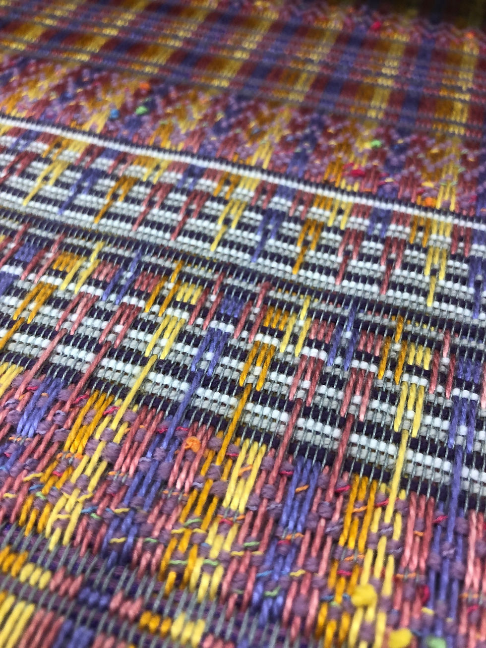
Over the course of this project, I have really pushed myself to see what I could create. I used my understanding of weave and its structures to give my collection new depth within its colour pallet from creating an ombre warp to creating my own second back beam using weights and small embroidery bobbins. I have explored many different warps over this year, this has really boosted my confidence in drafting. As you will see from my technical file, I have re drafted myself many times because I wanted to change my colours and vary the weave structure to create new warp pattern structures. Over the years in textiles, I feel that I have an understanding of what works and what doesn’t. However, there were hurdles along the way. Whilst creating my 40” warp, I stumbled across a number of faults and tension issues. However, with my accumulated knowledge of weave, I found ways to overcome the issues and tackle them head on. In developing my project, I feel I have accomplished the level of quality I have strived to achieve especially with my handwoven table loom samples and the attention to detail.


Anatomy and Apothecary


At the beginning of this project I wanted to look at the relationship between the body and its natural form. For instance, what truly fascinated me was how the body can protect you from injury's, illnesses and can fight off different diseases without you even noticing. I have been most passionate in the relationship between the skin and its out layers and how each its unique to each individual person. Developing form this I wanted to see how my woven practice can uses the idea of protection but also have unique look to it that no other protective garment has.
I began to develop my project, in collecting new and relevant information that would help my study of the body and its natural elements. For instance, traveling to the “the old operating theatre” in London, throughout this museum, there were artefacts and medicinal objects that help relate my project. This really made me engage with different medicinal features like Apothecary. Apothecary is the term used for a medical professor studying, making or selling.
Over the course of the project, I wanted to push myself in all aspects and really see what way I could experiment with the human body and how I could interpret it. I wanted to make a collection that use natural colouring, that was also very feminine. In researching protective clothing I came across a lack of stylish protective outerwear and accessories, Especially for woman. Most items were high vis construction, that once shined apron you could see. But once in daylight it looked boring and unfeminine. This make me look into reflective and protective men's wear, and I came across the brand Stone Island
Though out my project, I have developed a range of drawings and mix media that has supported mt woven works, I felt over this project it has been more useful for me to do more mixed media art pieces instead of drawings to foreshadow how the body is so fluid and most of my mixed media pieces are very transparent and have a lot of movement in them.
Stone Island as a brand for me are unique and set apart from many other fashion brands. They have a military style to them, with clean cut edges and precision making tailor garments for only men wear. However, in my research I have discovered more and more women wearing the brand. With this in mind. I wanted proposal to Stone Island to create a woman's collection using their military structured garments, as a base for my woven designs.


Miliken
project:
Urban Living
Developing my research for this project, I first took a look into
Scandinavian interiors and saw first-hand their attention to
sleek architectural designs and use of minimal elements, with
an urban twist to it.
My first hand observation started with using London’s
fabulous architecture but in an obscure way. Creating new
shapes with the refection’s of light and dark on the buildings,
once turned into black and white. This gave me the idea of
using not only Morden architecture but the 1920’s Art Deco
styles and its geometric shapes.
Furthering my contextual research, I came across a
Scandinavian woven designer called Tanja Kirst, she had
been studying in Como, Italy where she developed a love for
Art Deco interiors, architecture and its structural shapes, she
wanted to develop this further into her woven practice. By
using black and white with small inserts of pale colours. This
gave me my inspiration for the collection.
The two floor tiles are a juxtaposition of themselves but still
represent what I have wanted to achieve, I didn’t just want to
create just one choice I wanted to give you the option to play
around with shapes and structures in the space given, within
researching this – I have found that it stimulates the brain and
can spark new inventive idea.
Frida Kahlo:
Throughout my second year at Loughborough we were set the brief of studying Frida Kharlo. Visiting her exhibition at the V&A in London, I wanted to use her vibrant colours and her weaved shape structures to help transfer my drawings to my weaves.
The first half of my design project is more focused on her, her animals and the flowers in her garden. The second half was more focused and more researched on 'Day of the Dead' - a Mexican holiday.
I used skulls and incorporated Frida's head accessories and animals. I used a harsher colour pallet to give depth and shade to my new warp as it changed from a single cloth to an extra warp.
Studying Woven Design as my chosen pathway I have developed a skillset not just in creating new samples but also in setting up the Loom, dyeing yarns, assembling a portfolio of work and much more.


Urban
Deconstruction
My interpretation of Urban Deconstruction was to try and recognise how street art and new and old buildings can be intertwined forming new city landscapes with a more vibrant and acceptable design and colour pallet in todays's society.
The vibrant colour pallets with collections of Banksy the guerrilla sanctioned street art, unsanctioned artwork which has been accepted over time which coincides with new and old buildings alike.


Decoding
Nature
My Foundation year in Art and Design, gave me a good depth of knowledge to commence my degree course in the summer of 2017.
In my first year course in decoding nature, I started thinking how my projects could be brought to life, using photoshop and InDesign. I began using hundreds of flowers and created microscopic images to really capture the flower and it's layers.
Following on from this I drew outlines of all the flowers that I captured on my camera. Creating their structure with a continuous line drawing technique. This process developed and carried on throughout my sketch book.
Contact info
Email:yasminspraggs@me.com
Moblie:07540 781305
Address
1a Plymouth Drive
Sevenoaks
Kent
Tn13 3Rw
If you have any enquires please contact me on any of the above. Likewise on any of my social media' linked to the right.
References can be provided on request


